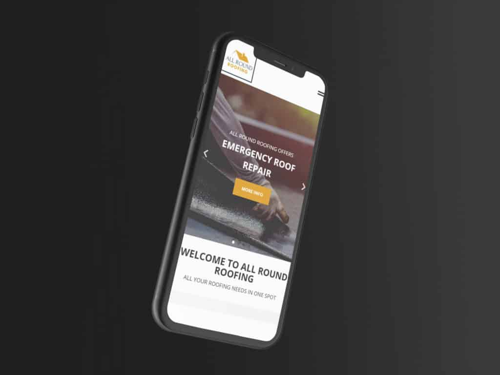
With a surge of mobile device users over the past years, designing a desktop-first website design may not work for you or your target audience. It’s time to think about mobile-friendly websites!
Just before 2019, crawling, indexing, and ranking systems used the desktop version of a page’s content to direct searchers to what they’re searching for. To stay up with the mobile-first wave, designers are now centring web experiences to be more mobile-focused. To clarify, mobile-friendly web designs won’t vastly improve your ranking or indexing, however, will introduce a full slew of other benefits for mobile searchers and your brand!
Check out 5 reasons why mobile-first website design is vital, and the way it’s become the new norm.
GET ON GOOGLE’S GOOD SIDE – SEO BENEFITS
Mobile-first web design can help your site rank higher on search engines like Google, for mobile users. Google now use mobile-first indexing, suggesting that they use the mobile version of your website to work out where you appear in their search results. By employing a web design that’s optimised for mobile, your chances of ranking higher on the Google computer programme results page are vastly increased.
Google has tools like ‘Page Speed Insights’ which might facilitate your determining if your site is good enough. If not, you will need help from an external agency, like us!
USER-FRIENDLY DESIGN
User-friendly design and mobile-first website design go hand in hand. Mobile devices have limited screen space available, as compared to a desktop or laptop. That being said, users expect to view a well laid out, user-friendly website, quickly and on their own terms, no matter their device of choice. On mobile devices, prioritise above-the-fold views and your information location throughout the website. Furthermore, a user-friendly design takes into consideration factors like visibility for call-to-action, a logical and easy-to-follow user flow, and data architecture; for content within the above-the-fold and more.
When engaging a digital agency like ourselves to make your website design, one with a user and mobile friendly design gives you the edge! When choosing to recruit the help of a website designer, we look after the whole process of website design, not only including the above but also branding, design, usability and performance. A win for you!
THE MAJORITY OF USERS USE MOBILE DEVICES
The main reason for mobile-first design, in our opinion, is the simple incontrovertible fact that the bulk of users on your site use mobile devices. From sites we manage ourselves, we see a mean of 60-70% of users using mobile phones. Tablets should even be noted at 5%.
That leaves desktops and laptops averaging 30%! In 2021, the quantity of unique mobile internet users stood at 4.32 billion. Indicating that over 90% of the worldwide internet population uses a mobile device online.
INCREASE CONVERSIONS
A mobile-first website design will vastly improve your conversion rate on mobile devices. With the improved website usability that an honest user-friendly design brings, the general user experience becomes more positive. Making users happy will increase the likelihood of them becoming returning customers.
This will not have any negative effects on desktop or laptop users either, since the mobile-first design is far easier to translate over to a desktop, instead of the opposite way around.
CONTENT PRIORITY BECOMES CLEAR
A mobile-first approach differs from the quality desktop approach in the way information is placed within the layout. A website designed on mobile should never require you to delete or hide information. Rather, it allows you to sort information into primary, secondary and tertiary content. The goal of your primary content is to answer a user’s query as quickly and efficiently as possible.
Using the mobile-first approach helps you achieve this, reviewing your site on a mobile device or mobile emulator on your browser.


