Like most things, website designs go in and out of fashion. From plain white blogs to multi-million sites we’ve come a long way with what we can do.
As website designers we custom build every site for each client to showcase the best of their business and brand – even then we’ve seen some similarities in requested design trends in 2020. Let’s take a look at some of those biggest trends in 2020 so far.
White Space, Dark Space
2020 is becoming the year of extremes in more ways than one. Darker colour websites are becoming more requested in businesses that want to give a sleeker look. This may be as ‘dark modes’ or energy-saving modes on phones and desktops are being used far more often, due to green initiatives or as conditions such as eye strain are on the increase.
On the opposite side, we are seeing a huge increase in white space websites. A return to clean spaces where the focus is on the content being shown to you. This has taken a step away from previous ‘cluttered’ websites.
PERFECT IMPERFECTIONS
A definite trend for 2020 is what I like to call perfect imperfections. From angles to overlapping boxes, we’ve used these on a number of our sites. Using an angled hero image is something simple and yet unique. It sets it apart from the standard full-width header. Using angles as a feature across your site allows you to make the most of white space. Take a look at how Aspect Hotel Park West’s website uses angles to enhance the hotel features and compliment their new striking logo.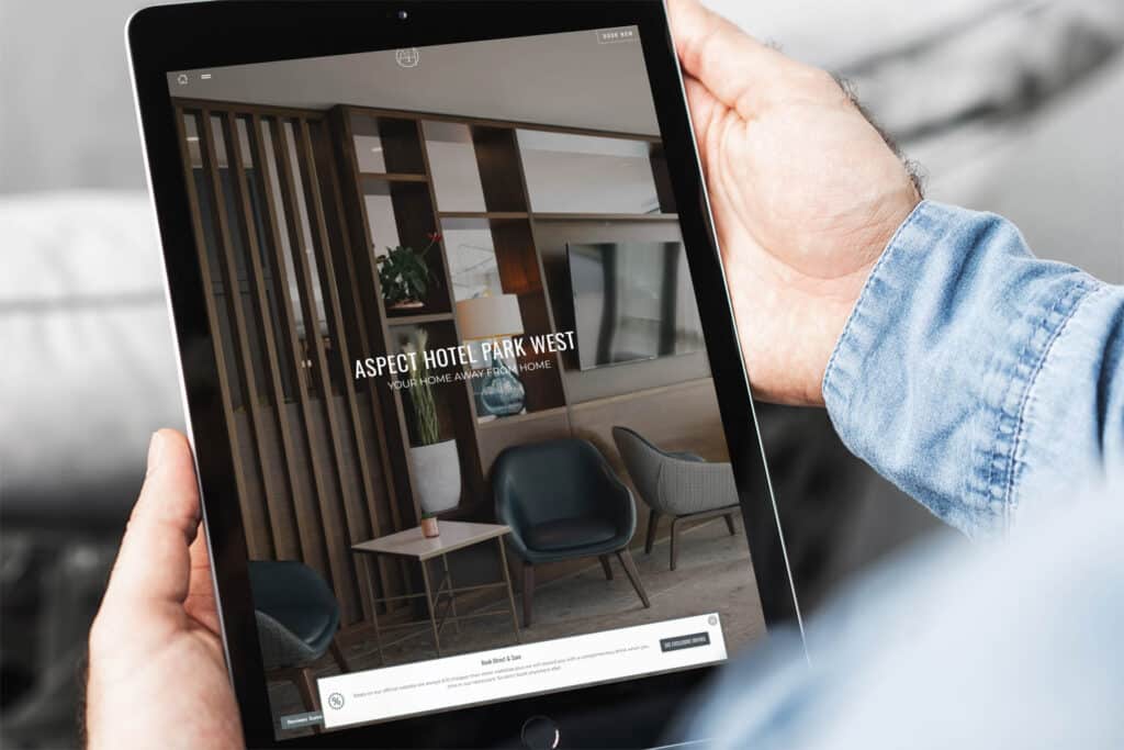
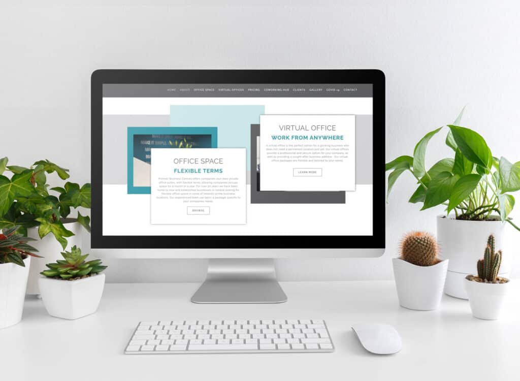
Using overlapping images and colour blocks is an excellent way of separating sections in a more interesting way. On Premier Business Centres’ new site we used motion effects and layered images to create an exciting way of introducing new locations of serviced offices. This feature is used throughout the site to convey their different services in a way that captures the user’s attention without being annoying.
BURGER MENUS
Yes, McDonald’s is back open – but this is a different type of menu. We’re seeing more ‘hidden menus’, meaning the user has to click to expand the full menu or site navigation. This works well for those with many services or pages they want to display, it avoids a cluttered top menu but we can also add important links outside the menu that are immediately visible. With Aspect Hote Park West we utilised this space to get the most important information to the guest.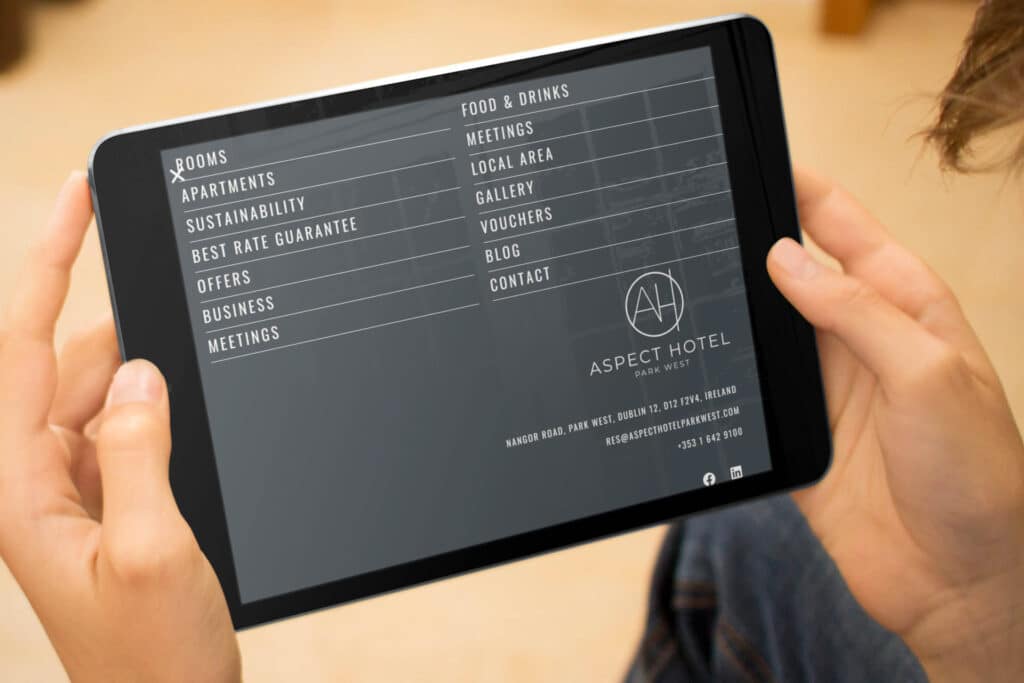
FILTERABLE GALLERYS
For any service industry – particularly hotels, your images are an important factor in selling your rooms and services.
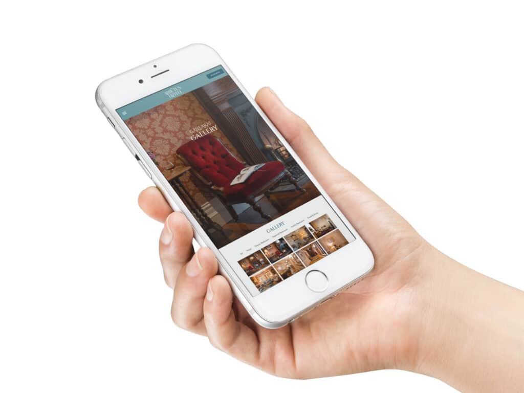
A simple way of helping your visitors see what their looking for is filterable galleries. Here the guest can see what is most important to them for example the design of the rooms or the quality of food.
ICONS
Showcase your business best aspect in a quick and visually appealing way.
Similar to using bullet points over lumps of text using icons is a fun and clear way of showing your most important selling points and features.
MOTION EFFECTS
Simple motion effects turn a plain picture into something exciting. There are limitless effects on what we can do with motion effects – from simple fading entrances of images, to sections and elements separating to reveal something hidden.
WHAT’S NOT IN?
Though design trends come and go there’s some trends that we hope are gone for good!
BLOCKS OF ENDLESS TEXT.
Similar to a blog post, some websites still have massive lumps of text on a plain white background. Not only does this make your site look outdated – it creates a boring experience for the user who likely won’t even read it.
NON-RESPONSIVE SITES
By now this should not be an issue – but every so often we come across a site on mobile that just doesn’t work. Over 70% of traffic is mobile so don’t exclude your market.
This list just shows a small fraction of what we’ve seen throughout the year – and what a year its been! Some trends are here for good, while others in a few years may inspire a ‘What were we thinking?’ moment.
